IMDb Redesign
IMDb.com was started in 1990 and is one of the first 50 public websites still online since the internet’s inception. It is a resource you may not realize you even use and has carried a design that has truly only ever been one of utility. All of that changes when we launch our redesigned website. Form will meet function and usability will marry delight.
My Role
Design all alternative layouts and UI elements for each responsive breakpoint
Design and document atomic components (atoms, molecules, etc.) for site-wide design language.
Synthesize user feedback from research studies
Design and develop iconography
Design site-wide color themes for AA accessibility
Create and deliver redlines for front end developers
Design and implement ad structure and flow for all ad slots across all breakpoints
Bridge cross-team collaboration for feature alignment

The Old and the New
As our users needs change, so must our website
The Old Site
In its current state, the site looks like this at first glance. It looks a little dated, but serves a purpose and performs necessary functions that our users are used to and expect. The primary functions of this section of the
page are:
Show the overall IMDb rating
Allow the user to rate the show or movie
Show off an initial trailer and poster image
Display a brief synopsis
Display a primary CTA to offer “where to watch” options
The New Site
The goals of this page are identical but there are a lot of tweaks made around the UI to improve the usability and increase interaction.
What has changed:
New responsive grid with five breakpoints
Full Google Material Design integration (with minor style tweaks for brand consistency)
Fully updated to support AA visual accessibility standards
Many other research driven design changes
The team has been able to update one of the most popular sites on the internet without removing any of the functionality that our fans are accustomed to. And with the use of Google’s Material Design guidelines, we’ve been able to make it even more usable and welcoming for newcomers used to common interaction methods found within material design.

Features
Here are features that I helped design and define
Interactions for Ratings and Popularity Feature
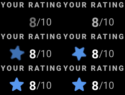
One of the main reasons people will visit IMDb is to rate movies and share their opinions. IMDb receives hundreds of millions of reviews every year. Building out the main interactions for how a user will rate and check ratings for a title was a huge honor.
Pictured here are the redlines that I built out to show how each button will be designed across each breakpoint.
One of the most fun parts about this leg of the project was building out iconography according to Material guidelines as well as the animations that accompany some of the interactions on the page.
TV Show Episodes Feature
Pictured here: The alt versions of the episodes feature that will live on every show page. This feature tells users about an upcoming episode, a previous episode, and most popular episodes from the show. These alternative designs account for when we inevitably have missing data points or a lack of information regarding a given episode. They also show affordances for users to contribute content as well when we may have gaps in our data.
Data Availability and Alternates
IMDb is host to over 7.5 million titles for both for movies and shows. The amount of data that we have for each show varies and as such must be represented as we design the new website. This means that we have to account for alternative versions of each feature when we design them, just in case there is missing or extra data for that particular show or movie.
Building the Hero Feature
When a user lands on IMDb, the first thing they will see is what we call the “Hero”. The Hero displays all of the “need to know” info for a given title as deemed by extensive user research. There are thousands of data points throughout the page, but this main hero section draws all the top-level needs and delivers them to the user in a quick and concise way. It was my responsibility to define all of the small interactions that users will have across all breakpoints.
You’ll see that there are different versions of each hero element. A Video Game hero for instance, gets a different UX to serve that particular titles needs. Whereas a televisions show might need a set of controls to pan between episodes or filter episodes.

IMDb Color Story
I designed a bunch of the color story for the new IMDb
Making IMDb’s Color of Motion
I’m obsessed with Colors of Motion. If you haven’t heard fo them, please do yourself a favor and check them out. What happens when you take every frame of your favorite movie and turn each of them in to a series of bands in a spectrum. Does it tell the same story? I was massively inspired by how much emotion could be conveyed when you just see frame colors in a spectrum. As I helped design IMDb’s color story, I thought to myself, what would IMDb’s Color of Motion look like?
Blade Runner 2049
Donnie Darko
Blade Runner
Beauty and the Beast
Deadpool
La La Land
50 shades of gray and white… and black
IMDb’s UI colors are broken into three main categories: Shades, Accents, and On Colors.
Shades
Shades are used for the backgrounds for the page.
All accents will lay on top of these shades.
There are two sets of shades, we call them base and base alt
Accents
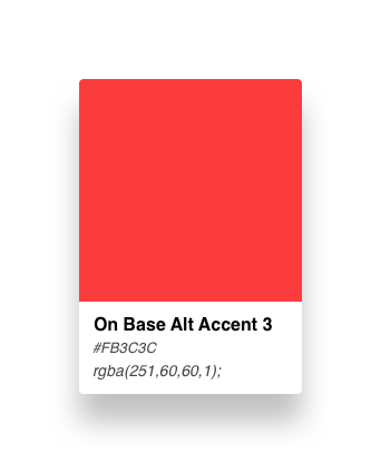
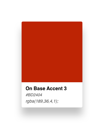
Accents are added colors used to define primary, secondary etc. elements within the UI
All accents except for the yellow one (brand yellow) must be fully accessible with each base shade’s “on color” and must also be accessible as text on both base and base al shades.
There are 8 color accent variants total.
On Colors
On colors are text/icon colors that go on top of the accent
All text and icon variants must be AA accessible on top of each accent
We used this chart to help explain the complexities around the different uses of color.
When testing out colors, I worked backwards from their uses. I knew we had to have a success green, a failure red, etc. but each color also had to contrast well with the already established yellow that we use for the IMDb brand.
The colors couldn’t be too pastel, or too chromatic, so there was a lot of time spent scanning through different color wheels to find the exact right color. Once I thought I had it, I had to contrast it next to the others and adjust them accordingly. For instance, just as I thought I had found the perfect “success green”, I put it next to the red and the feedback I got was that it was too “Christmassy”. So, I had to go back to the drawing board and find colors that deviated away from Christmas red or green.
Typography accents
Each accent had to be accessible on every shade for every font style. So, as I scanned through the color wheel, I also had to type out example words in each text style to check to make sure that each color accent was at least AA accessible for all fonts, accents, and shades.
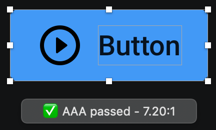
Example buttons on their backgrounds with their individual On Colors.
I used Sketch plugins to test the accessibility standards as I designed.


